Style guides ensure branding stays consistent regardless of what is being created or who is creating it.
When done right, they clearly communicate the do’s and don’ts of your brand aesthetic to everyone in your organization. Rather than rely on designers to explain branding details over and over again, style guides provide a go-to resource that addresses common questions regarding colors, logos, fonts and more.
Before we dive in, however, it’s important to note that creating a great style guide isn’t something just anyone can throw together in an afternoon. It takes a skilled designer to lay out the specifics. A style guide can (and should) get technical and be developed with a discerning eye, so be sure to get your design team involved in the process from the very start.
With that in mind, let’s tackle the six steps of creating a comprehensive brand style guide from start to finish:
1. Define your brand ethos
It helps to start your style guide by summing up the big picture of your brand with a motto or short statement. This is particularly useful for larger, public brands.
In Suttle-Straus’ style guide we define our brand’s guiding principles with our mission and vision statements so that everyone in the company knows what makes us tick and why we do what we do.

2: Determine proper logo size and placement
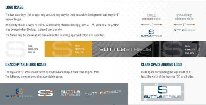
Logos are the centerpiece of a brand’s visual identity and are often the single most recognizable piece of your brand. As such, it’s important to keep the look and feel of them consistent from one piece to another. Your style guide should clearly lay out the rules for how your logo should be sized, positioned and colored.
Logo variations: Do you have different versions of your logo for different applications? Show examples of each and describe when and where each one should be used.
Color variations: It’s important to determine when your logo should be used in full color, 2-color or 1-color. If you use pantone colors be sure to include those, along with when it’s appropriate to use your logo reversed out or in black and white.
Size restrictions: Most companies put limits on how large or small a logo should appear.
Margins: To help emphasize your logo and ensure it doesn’t get lost among other elements on the page, you’ll likely want to leave some space around it. Describe how much breathing room your logo should have.
Bad examples: Along with the do’s, be sure to include some logo don’ts. This could include using the wrong color, skewing the logo, or altering the lock up.

3: Proper color use
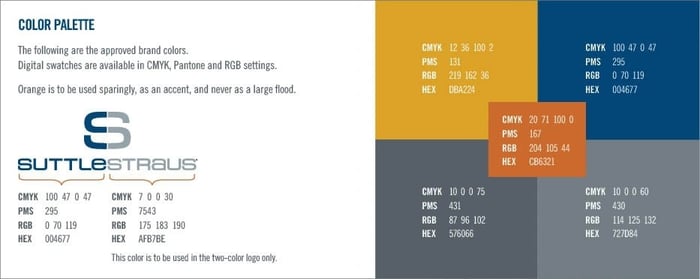
It's important to use color to breathe life into your brand, however, you can have too much of a good thing if limitations aren’t communicated effectively. The more information you can provide about your brand colors and their proper use, the more consistent your brand will feel.
Principal brand colors: These are the colors that make up the core of your brand. When and where should they be used?
Supporting brand colors: These are the colors that come into play when more is needed.
Technical details of color identification: Include the RGB, CMYK and HEX codes for each of the colors in your brand’s palette so they can be referenced in both web applications and print.

4: Typefaces
Nothing ruins an otherwise well-designed piece like a tacky typeface, which is exactly what tends to happen when limits aren’t set.
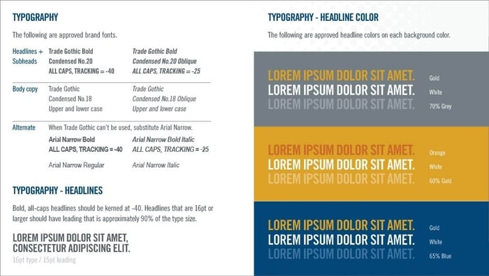
Start by defining the typefaces or font families that represent the core of your brand, as well as a list of rules covering when and where to use them.
Give guidance on:
Typeface names and weights: List each brand typeface along with their corresponding weights (e.g. regular, bold, light, condensed).
Typeface applications: Is one font used specifically for headings while another is meant for body text? Describe how each font should be used in context.
Size specifications: Just like your logo, you may not want things to get too big or too small. Include sizing limits for each typeface. If you can, provide a ratio guideline for header and body copy size differences.
Other considerations: Are there instances where the type should be in all caps? Or all lower case? Should there be a certain amount of space between lines of copy? Are there specific colors that should be used, especially when used on top of another color? Include as much detail as possible to help guide your content creators.

5: Image and photography guidelines
Making your brand feel authentic often means giving your team a reasonable amount of flexibility to combine graphics, photography and other images into the core components of your brand, but “reasonable” is the key word. (See also: What are your pictures saying about your brand?)
Here are some particulars to consider:
What types of images should be used? Some companies use original photography, some purchase stock photos, some only use illustrations. Communicate what type of imagery your company uses along with where those resources can be found.
How should images be presented? Specify if images should be treated a certain way, for example do they have rounded corners or hard angles? Should they include people or be abstract? Are there any effects applied?
Can logos be placed over photos or other graphics? When done right, combining logos and photography effectively can go a long way in personalizing your brand.
Do you have a graphic element? A lot of brands have additional elements that are considered part of their brand, for example the use of a pattern or a texture. Whatever it may be, be sure to include those pieces in your style guide.
Do you use icons? Icons are a great, modern way to jazz up a piece. Determine if they are acceptable in your materials. If so, make sure they’re from the same icon family so they have the same look, and match them to your brand colors.

6: Define your brand’s voice and writing style
If your company logo doesn’t appear along side a piece of your content, will your audience know that it’s coming from your brand? Your brand voice and writing style should be just as identifiable as your company logo.
A brand voice is the tone of a company’s communications and if you are not careful, you can end up with a random assortment of voices. Your style guide should give clear directions on how to put your brand into words as well as what to avoid.
You should also determine writing style guidelines that cover grammar, punctuation, spelling and usage.
Summing it up
As you set out to create your own style guide, keep in mind that there is no right or wrong way, or minimum or maximum length. Depending on the size and scope of your brand, you may need far more or far less information.
Start by deciding how much or how little guidance your brand requires and structure your style guide around what matters most. Use the points discussed in this article as a guide, and determine how detailed you need to be within each category.
Keep in mind that a style guide document is never really “finished,” it will morph and transform, just as your brand does. Be sure to revisit it frequently and update when needed.


