Every year, Suttle-Straus holds an employee awards ceremony with dinner and entertainment. At the event, employees are recognized for their years of service, certificates of craftsmanship are presented, and circle of excellence and key employees are announced. In addition to the awards ceremony, itself, we feature different entertainment each year. Once we heard our entertainment this year would be a mentalist/mind reader, our Creative team started discussing concepts.
CONCEPT
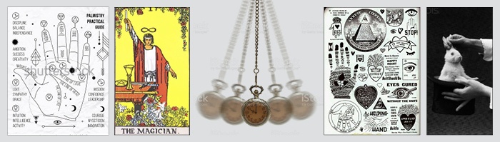
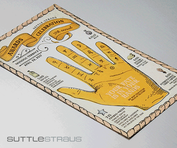
We started thinking about old school magicians, mind readers and vintage palm reading posters. Once we established our graphic theme, we wanted to take the invitation to the next level by incorporating some sort of interactive component, creating a sense of “illusion” that would mimic the entertainment. Of course, we work inside our very own printing haven, so possibilities are endless…within reason. Throwing out ideas such as illusion-type paper, 3D material, scratch off ink, heat/UV sensitive paper, and disappearing ink, we ended our brainstorming session excited about the potential of working with a specialty ink that would reveal content for the event. We weren’t sure if some of these ideas were even possible or if we could run them on our printing presses, so we had some research to do.
RESEARCH
Before gaining buy-in from our planning committee, we needed answers about how we would accomplish this concept. Meeting with our pressroom manager, Jason Sieling, we found out our press equipment could run specialty ink, but because we had not used it before, we’d need to do a little more research and testing. Jason was able to find out which specific inks were recommended for our presses and set up a conference call with the ink company.
Some highlights from the meeting:
- Ink Options: There are several different types of reactive inks (sunlight, reveal, temperature) but only one worked with our concept and was recommended for conventional printing. Thermochromic ink, which is activated by body temperature (31°C or 88°F), was the best option. We learned via our sample that if someone had cold hands they would need to rub the ink in order to get it to activate.
- Coated or Uncoated: The ink activates easier if printed on a coated sheet with multiple hits. In the end, we also ended up adding an overall gloss aqueous coating to ensure more durability because of the probability of the pieces being handled frequently.
- Conventional or UV: The UV ink was recommended for stronger color strength.
- Cost: While this ink was a little more costly than traditional inks, we were willing to splurge for this project to push the creative envelope further than we have before.
- Transparency: The thermochromic inks for conventional printing are transparent, so they wouldn’t hide anything underneath. Our idea to reveal content underneath changed to be more interactive by changing colors.
- Ink Colors: Our color palette was limited to twelve, with four of them being color to color ink (think mood rings) and eight of them, color to colorless (paper). It was recommended to leave any color printed behind the thermochromic ink a light tone, allowing the ink to pop more.
- Turnaround: It would take ten days to receive the ink, once ordered. We were working on a bit of a time crunch so we needed to act fast. We ordered samples as soon as possible.
- Shelf Life: Once printed, the activation length is good for over a year, which provided plenty of time to promote our event.
CHALLENGES
THE UNKNOWN
After a few more conversations with the ink company and reviewing the samples, there were still a lot of unknowns. However, we knew this would be a learning opportunity for all of us. From setting up the file to how it would react on press, no one really knew what to expect. For a designer, this was, for lack of a better term, “shooting in the dark.”
We thought, what if we could manipulate the coating so it would reveal some lesser important content underneath? We set files up featuring the ink in multiple variations, as this was an experiment. We printed the ink alone, as well as with a background color, to see how it would react.
The decision to use this ink also impacted the design. Since it was something new to our employees, a caption was added to the design to inform them of the fun, interactive component. We also printed the ink on the outer edge of the pieces so it would automatically activate when held in their hands.
BUDGET

With the higher ink price, we looked for other ways to to keep the overall cost down before presenting the concept to our planning committee. Considerations included paper type, quantity, size, etc. We found if we laid out the press sheet to include all of the components for the campaign, as seen above, rather than printing each piece separately, we could save quite a bit. This would increase efficiency on press and save time in bindery. However, this also meant we would need to have all of the components designed well in advance, including pieces that we didn’t traditional produce until closer to the event.
This specific campaign had several components, including an invitation, RSVP card, promotional poster, payroll stuffers, and event materials such as dinner meal cards and drink tickets. With all of the components on a single press sheet, we chose a house stock, 100# Sterling Cover, that worked well with every component. The press sheet layout allowed us to have four RSVP cards up, which was a great opportunity to print different art for each one. We then randomly split the employees into four groups to ensure they would receive different designs. The same happened with our payroll stuffers – printing them three up, we could feature different art on each one, so every two weeks there would be a new insert promoting the event.
We were able get buy-in from the planning committee for the entire design concept. By having all necessary information up front, our estimate actually came in lower than last year's print material cost. The best part is that every component featured the specialty ink somewhere on it.
Once we got on press, our team had fun seeing the effectiveness of the coating, and with our cold Wisconsin mornings, we were able take the press sheet, hot off the press, outside to cool it down and see the color change instantly.
TAKEAWAYS
In the end, we found that the thermochromic ink is completely transparent. Even though we tried to manipulate it, the colors underneath still showed through. Also, because of this transparency, there was no need to knock out darker colors behind the specialty ink.
This campaign generated surprise from a lot of our employees, as most didn’t know we had this capability. After all, our Creative team had just learned about it recently. It was an amazing learning opportunity for both our Creative team, as well as our Press team.
Want to see these samples in person? Let us know by emailing marketing@suttle-straus.com. Please include your mailing address so we know where to send them.
Interested in working with our talented Creative team on your next project? Contact us via the link provided below.

Editor’s note: Using thermochromic ink also qualifies for a current USPS promotion, so there was the added possibility to save a little on postage. For additional ideas of ways to improve your mailer and learn if it qualifies for a USPS promotion, click here.