Most often when you think of one-color printing, you think of black ink on white paper. However, changing the ink color can be a great alternative and the good news is that it doesn’t change the printing cost. This design technique can be advantageous to your marketing because the result is a unique look, not often seen on the average piece of collateral.
So what colors work best for this technique? Really, any spot color can be used, which means there are literally thousands of colors to choose from. Imagine the possibilities!
Note: A spot color consists of one printing plate as opposed to multiple plates (cyan, magenta, yellow and black) and can only be done on offset production equipment. Spot color printing is a great way to keep brand colors consistent across print materials.
The samples below show different ways to utilize a one-color option, most of which were designed by our in-house Creative team.
Envelopes
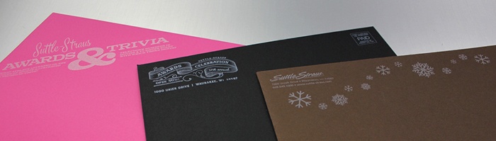
These examples feature one-color printing on the exterior of an envelope. They all used white ink on an uncoated colored stock.
Note: It’s always good to check with the post office on the spot color you want to use on a colored stock to make sure it complies with mailing regulations.

For added interest, consider using a spot color on the inside of an envelope. The series shown above features one-color printing on the inside of various sized envelopes featuring the company’s brand colors. Who knew envelopes could be so fun!
These envelopes were part of a brand refresh that was awarded an ADDY award from the American Advertising Federation - Madison in 2016.
Event Materials
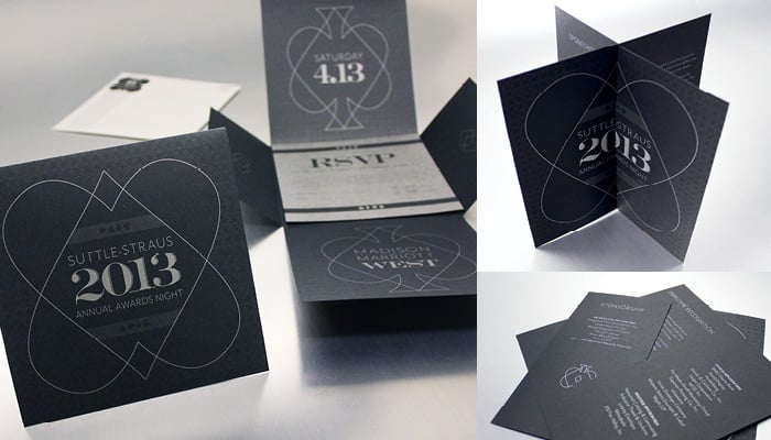
This invitation, rsvp, and event program all feature a metallic spot color on an uncoated black stock. Something to keep in mind with printing on an uncoated stock is how much the ink absorbs into the paper. It may require two hits of ink in order for it to stand out.
On this example, there are areas that appear more intense than others. This was created using tints. If designed correctly, tints can create an illusion of multiple colors. This gives the piece more dimension without the added cost.
Calendar
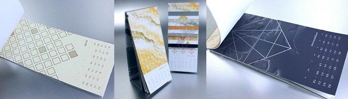
The 2017 Suttle-Straus calendar featured different printing processes that used one to three spot colors. The months of April and November featured a metallic spot color on a colored stock. April used a gold metallic spot color on a gold Reich shine paper stock, while the month of November featured a silver metallic spot color on a dark blue Curious skin paper.
To see the hurdles and considerations of this project, read the blog article, "Trials and Triumphs of the Suttle-Straus 2017 Calendar."
Certificate
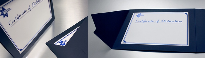
This next option features a foil stamp on a white stock. Although it doesn’t technically print, it’s a special effect applied in a one-color scenario.
Paper Accents
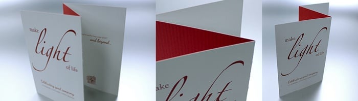
Using a duplex paper stock that features the same color as the ink you want to print is another great way to enhance your design. This example was designed by one of our clients and features a red spot color on a 120# Neenah Classic Columns Red Pepper/Solar White cover stock.
If these ideas have inspired you to take on a one-color print design, first be sure to ask yourself this question: Does a one-color design make sense for the piece? Know what your desired outcome is and if a one-color design will allow you to get there. If so, then you can proceed, keeping these considerations in mind when starting your design:
- Will your paper be coated or uncoated?
- Will your one color be an ink, a coating, or a special effect?
- Should you incorporate tints of the one color?
- Will it comply with USPS regulations if being mailed?
If you’re still unsure or need help with your design, contact us. Our award-winning creative team is experienced in designing print collateral of all kinds – from one color through six colors, and from simple mailers to full campaigns.

Looking for other ways to keep print costs down while still making a statement? Read the blog article, “Folds: Making an Impact on a Budget…No Die Required!”