The psychology of color and its effect on our buying decisions has been a topic of discussion among marketers for years. There are countless resources and studies that have been done on colors, but what is right for your marketing?
Despite a number of well-run studies revealing fascinating insight into color and human behavior, many marketers still cling to some less-than-scientific schools of thought, which often oversimplify and distract from the truth.
Usually, these boil down to rules that assign certain feelings to specific colors. Charts like the one below, sum up this approach to color science:
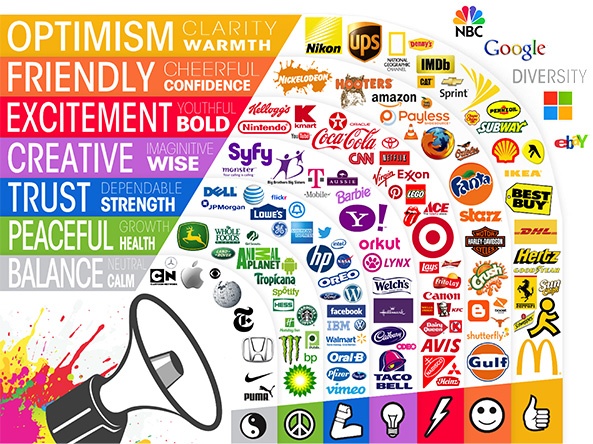
While that idea that “blue shows trust” can be appealing to marketers trying to justify their decision to pick one color over another, it fails to take into account the evidence1 suggesting that factors like context, personal experiences, upbringing, and cultural differences can make your perception of blue much different than others.
In short, color is too dependent on personal perception to translate directly to a particular feeling or emotion.
So now what? The good news is that there’s also been plenty of reputable research on color psychology that shows color does play a role in our decision making process.
Here are some tips for choosing colors for your marketing materials:
Choose colors that “fit” the product or service
If you’re asking yourself which colors are “right” to use with your marketing materials, you may not be asking the appropriate question. Just like choosing a suitable image to include in your piece, relevance is key.
Results from studies like the Interactive Effects of Colors2 show that brand colors work best when consumers perceive them to be “appropriate” with what’s being sold.
In other words, rather than worrying about what kind of mood or emotion a certain color will evoke, it’s much more important to choose colors that “fit” the personality of your brand.
A camping gear company, for example, should recognize that their customers are looking for products that fall in line with an outdoor look. Therefore, their marketing materials should reinforce that sensibility with a natural-looking color palette.
Differentiate new brands from well-known competitors
Findings from Color Research & Application3 suggest that new brands, in particular, have more marketing success when they choose colors that differentiate themselves from brands that are already entrenched in their customers’ minds.
While differentiation is important, common sense should also be used. If your competition predominantly uses a certain color, why? Do extensive research into your market and take those considerations into account when choosing your colors.
The goal is to find the balance between being unique and being recognizable in your industry.
Colors and gender
A study4 by researcher Joe Hallock looked at color preferences by gender with some striking results. In his study, which was comprised of 232 people from 22 countries, he found that over half of the men and 35% of the women favored blue over every other color.
But, while both groups preferred blue, men and women disagreed strongly on purple. According to the study, 23% of women said it was their favorite color, while nearly just as many men said it was their least favorite color. In fact, not a single man claimed it as a favorite.
Of course, it’s important to keep in mind that details like these should only be considered if your ideal buyers are predominantly male or female.
Check out Joe Hollock’s Colour Assignment for more findings on color preference and gender.
Conversion rate based on color
It’s the question on every marketer’s mind: Is there a “best” color for conversion? What color should your call to action (CTA) be to get the highest response?
Despite all the anecdotal evidence5 pushing one color over another, there is no single color that excels when it comes to conversion. A color’s ability to make someone convert is more about its context than whether it’s blue, green or red. Factors like where a CTA is located on a webpage, the size and styling of it, and how it looks against other elements on the page are just as important as the color.
Choosing colors to help you stand out
This is called the Von Restorff (or Isolation) Effect6, which basically states that things that stick out get remembered.
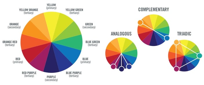
To apply this idea to the brand palette you’ve already established, reference a color chart to identify a series of base colors around your brand and the contrasting, complimentary or tertiary colors you can use to make a marking piece stand out.
The bottom line is simple: Color perception can change drastically from one person to another based on many factors outside of your control.
While there is no defined set of guidelines for choosing colors that will work better than others in your marketing pieces, context is key. Consider your color choices in relation to the products and services you offer as well as the audience you’re trying to engage with.

References
1. http://www.ncbi.nlm.nih.gov/pubmed/2289687
2. http://mtq.sagepub.com/content/6/1/63
3. http://onlinelibrary.wiley.com/journal/10.1002/(ISSN)1520-6378
4. http://www.joehallock.com/edu/COM498/preferences.html
5. https://thelogocompany.net/blog/infographics/psychology-color-logo-design/