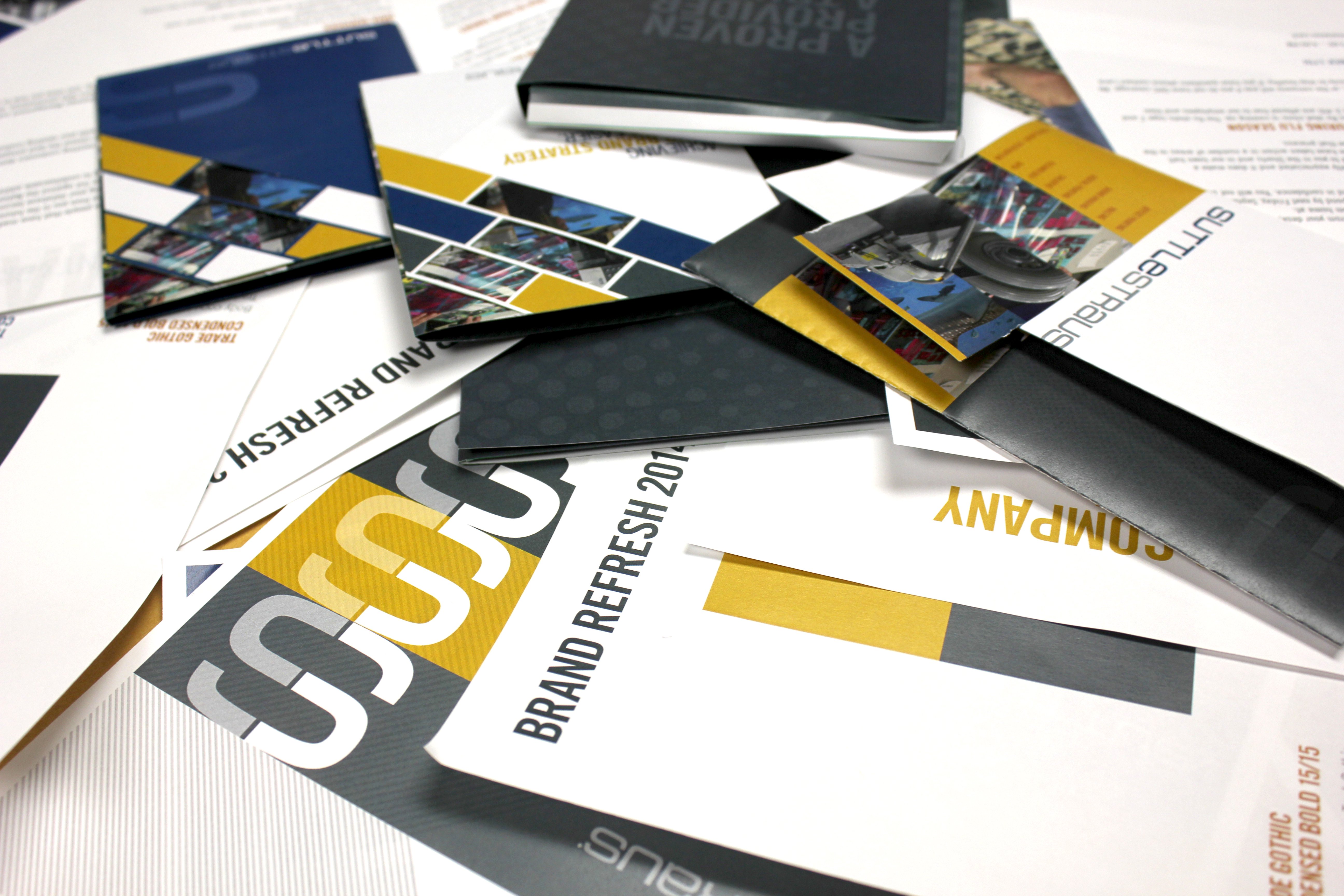
Did you know that common mistakes in logo design can cost your company thousands of dollars for the lifetime of brand logo use? It's true. Many people design logos with a "web first" mentality now. However, every logo has to be printed at some point - what startup tech company CEO would go without business cards? Therefore, logo design can impact the cost of company stationery and other marketing collateral for life. When contemplating designing (or redesigning) your company logo, don't make these errors:
Not Considering All Applications
A logo is the most essential marketing item a business has, and it must be flexible enough to be applied to anything.
Most people design a beautiful logo for their website, but years down the road when the logo has to be applied to polo shirts or coffee mugs find that it doesn't work. Consider these uses for your logo and make sure you have a one-color version that will work on:
- Embroidery
- Silk screening
- Engraving or etching
- Embossing or debossing
Choosing a Color Unfit to Print
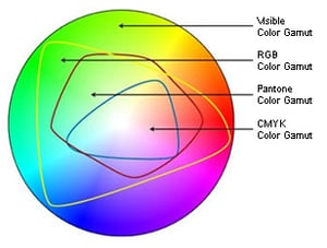
If you didn't already know, printing is a combination of Cyan, Magenta, Yellow and Black (CMYK) inks. Some colors on the visible spectrum or displayed by computers and digital screens can't be achieved by using these four inks. If you choose a color that can't be mixed in CYMK it means every time you want to print something it has to be done with a Pantone spot color, and that means more charges added to your bill. In the below image from Printernational you can see the CMYK area is the smallest, if you pick a color outside this area your printing is instantly more expensive for everything you want to produce.
Here are some colors to avoid when designing your logo:
- Pastels - If an ink mix consists of a lot of white opaque ink it will start to yellow within a year.
- Fluorescent colors - These require special inks with fluorescent chemicals mixed in that emit and reflect light. They will fade over time and with exposure to sunlight.
- Metallic colors - Also require specialty inks with reflective metal particles such as copper, bronze, zinc or aluminum. Or could be done with more expensive foil stamping.
- Reflex blue - These rich deep blue and purple inks take forever to dry and are problematic to color matching.
- Oranges - Most oranges are outside the CMYK color gamut, so these are hard to match screen to paper.
Following a Trend
It can be tempting to incorporate a trending style into the graphic design of your logo, like popular patterns and color palettes - don't do it! All trends eventually fade away, which means someday your logo will look out-of-date and you'll have to redesign it all over again. The best logo designs are timeless.
Making the Logo Too Complex
Adding small font taglines or other super-thin lines, called hairlines, in a logo design can make it difficult to execute properly. This will not make your logo scale down easily either.
Remember, your logo may have to shrink small enough to fit on the side of pens, and if you have a website it will also have to work as a 16 x 16 pixel favicon (that little icon at the top left of each of your browser windows).
Tight alignment of multiple colors can also be problematic in logos. If something is being printed by hand that requires a separate application of each color, the alignment can get off slightly in any direction and gaps between your colors can show.
Forgetting to Think Big
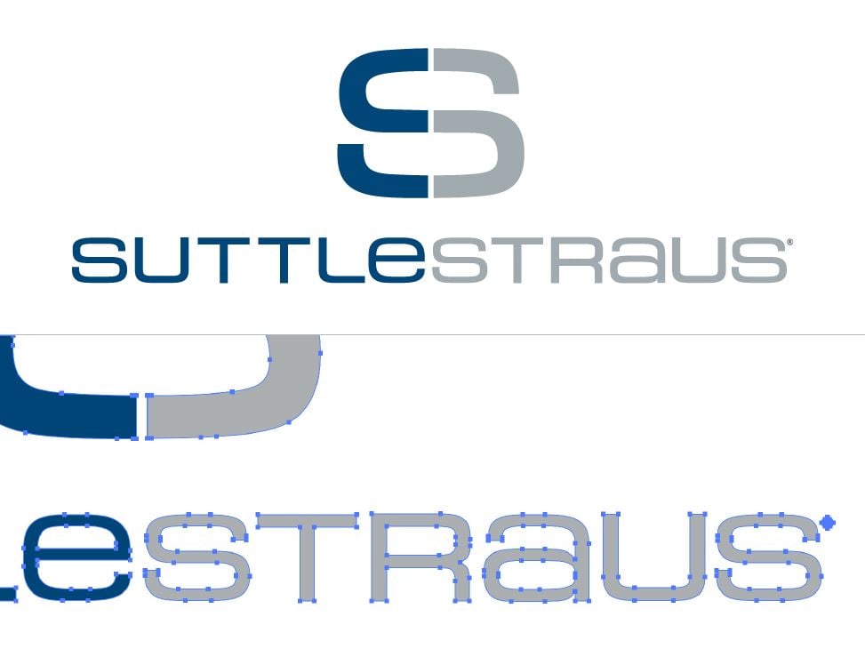
Your company may be small now, but someday your logo may be on a billboard or the side of a building. Just like you need to think about how your logo will look somewhere tiny, you need to consider how it will display in large formats. For that reason your logo needs to be designed in a vector format. Vector files are made in Adobe Illustrator and can scale to any size easily without getting fuzzy. Raster files made in Adobe Photoshop when scaled to large sizes will look pixelated and unclean. Make sure your logo is a vector logo, saved in a common format like EPS.
Before you fall in love with a logo design, it's always a good idea to run it by your printer and/or promotional products provider. They can point out any design aspects that could be difficult or costly to achieve. It could save you a lot of money and headaches in the long run!